dataviz
/dataviz75
For nice and ugly data visualisations
The price of gas at the pump of the last 35 years in constant 2025 $CAD ⛽🚘
It got more expensive, +/- 30%, although it's been impressively steady since 2010 in most cities.
It got more expensive, +/- 30%, although it's been impressively steady since 2010 in most cities.
Charts
13833
Kaloh | Indexy.xyz 📊
@kaloh·11:54 11/04/2025
Am I the only one seeing crypto charts here? 😬
"To address this challenge, tidyplots provides a user-friendly code-based interface for creating customizable and insightful plots."
If you want to try new ways to mâle dataviz :)
https://onlinelibrary.wiley.com/doi/10.1002/imt2.70018
If you want to try new ways to mâle dataviz :)
https://onlinelibrary.wiley.com/doi/10.1002/imt2.70018
😁😄
229608
Takens Theorem
@takenstheorem·05:00 24/03/2025
Excellence in the physical properties of books published since 1910 (Dwiggins, 1919)
Pages by Lajos Illyefalvi’s statistical albums of Budapest.
That's super impressive 😳
Source: https://nightingaledvs.com/exploring-hungarian-data-graphics-with-attila-batorfy/
That's super impressive 😳
Source: https://nightingaledvs.com/exploring-hungarian-data-graphics-with-attila-batorfy/
A visual taxonomy of medical hallucinations in LLMs, organized into five main clusters
Loading...
🔥
545246
Alex 🍊
@asteure.eth·08:22 17/03/2025
Anna's Archive organized a /dataviz contest for « all the ISBNs in the world » (or all they could find), based on several libraries and also showing if they have it in their digital library.
Winners have been announced − you're welcome for the rabbit hole!
https://annas-archive.org/blog/all-isbns-winners.html
Winners have been announced − you're welcome for the rabbit hole!
https://annas-archive.org/blog/all-isbns-winners.html

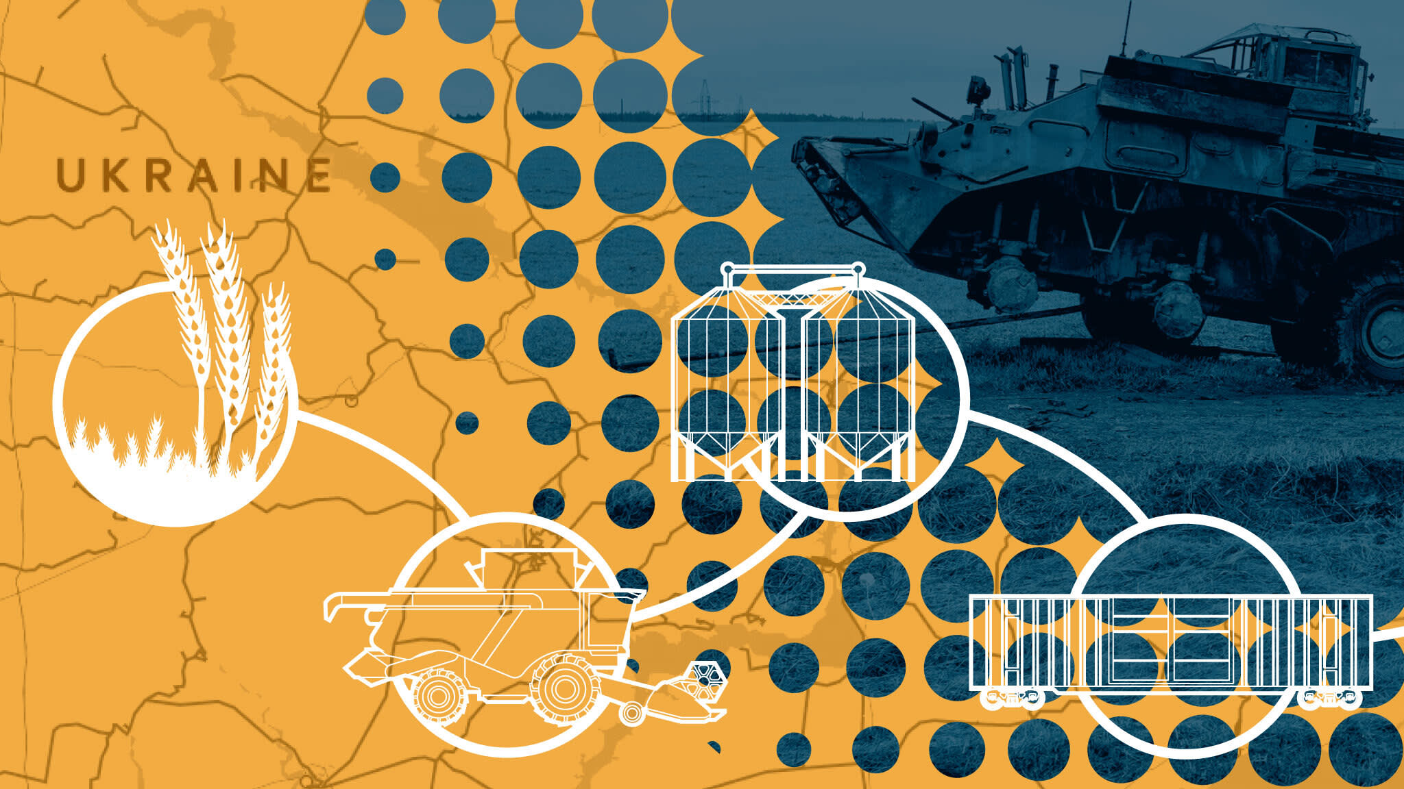
Many beautiful and interactive maps. FT rarely misses their dataviz 👌
https://ig.ft.com/ukraine-war-food-insecurity/
https://ig.ft.com/ukraine-war-food-insecurity/
Liquidation HeatMap: In short, it predicts the price levels at which large-scale liquidation events may occur.
A liquidation event occurs when a trader's positions are closed due to price fluctuations and their margin account balance is insufficient to cover the open positions.
Traders who can estimate the liquidation levels of other traders may gain an advantage similar to understanding high liquidity in the order book.
Evolution of Alcohol belts in Europe
Source : https://blog.datawrapper.de/europe-map-alcohol-consumption/
Source : https://blog.datawrapper.de/europe-map-alcohol-consumption/
XP flowers 🌸✨🌸
229608
Takens Theorem
@takenstheorem·14:51 21/02/2025
Farming XP with NFT trading...
I was short thinking ~200 of my followers were bots 😅
I guess I have mid-content.. idk
You can check your stats here https://dune.com/jkavithamahesh/farcaster-followers-and-following-with-spam-label-by-fid?fid_n26d36=21348
I guess I have mid-content.. idk
You can check your stats here https://dune.com/jkavithamahesh/farcaster-followers-and-following-with-spam-label-by-fid?fid_n26d36=21348