accessibility-design
/accessibility-ux59
If we design with accessibility in mind, crypto gets easier for everyone. All about accessibility design and UX. Warpcasters of all abilities welcome. Purple power.
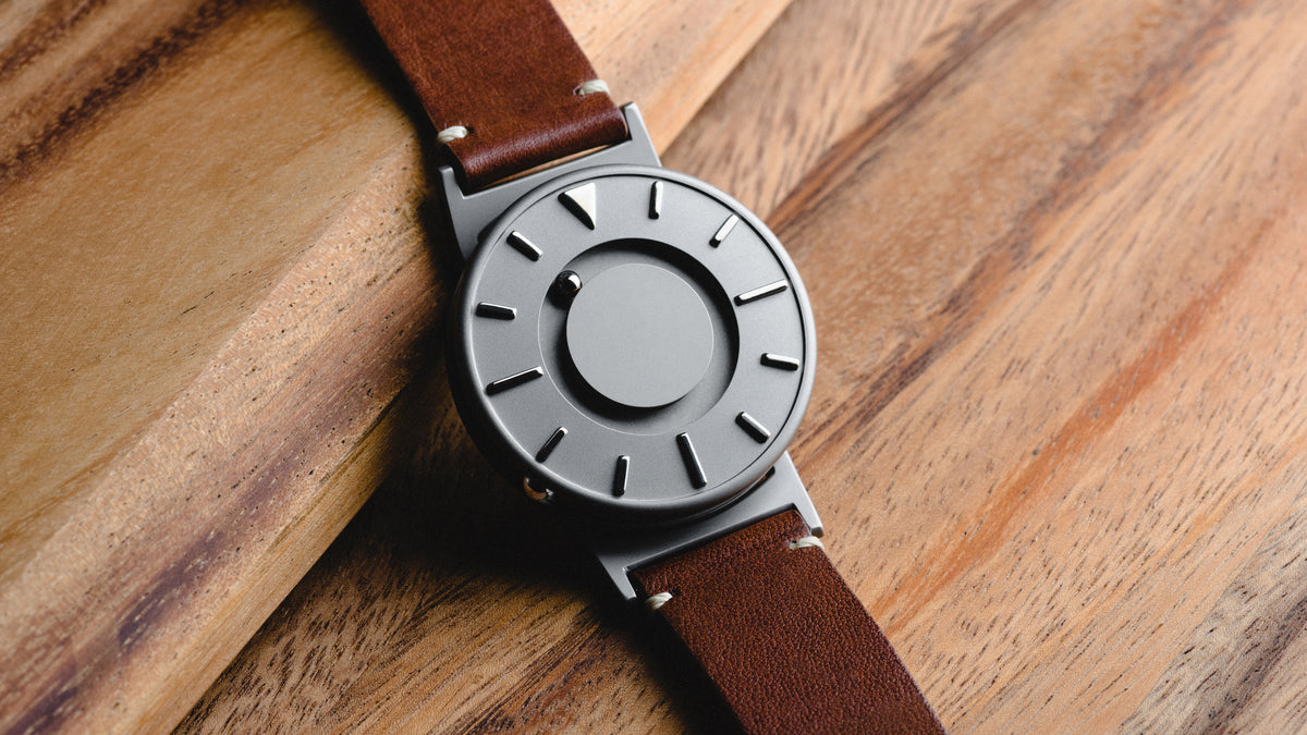
Regarding accessibility in the built environment, I hadn't thought to consider watches and timepieces, until I found this mention in my Princeton Edunext a11y course - for tactile watches. This watch allows anyone to check the time by just feeling the watch. https://www.eone-time.com/pages/our-story
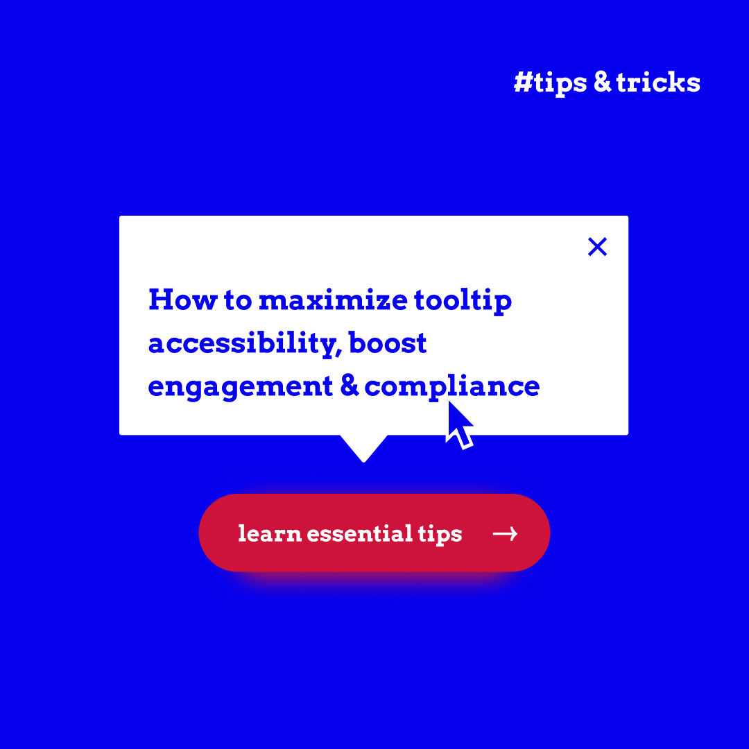
At my day job, I'm helping to design the user interface for a web app. I needed to know about best practice in plain language for tooltips, did a search and found a comprehensive article about tooltips in web accessibility. If your job includes designing user interfaces, this'll give lots of "tool" tips and tricks....haha. https://www.a11y-collective.com/blog/tooltips-in-web-accessibility/
I found a resource for Accessible User Experience during my studying. Check this one out, if UX UI is your job. https://www.texthelp.com/resources/digital-accessibility-guide/accessible-ux/
I did it! Today I paid for membership in the IAAP which is the International Association of Accessibility Professionals. I'll get a badge soon, and membership benefits include access to their archived knowledge base of webinars so I can better study for certification.
Tonight I was studying for my accessibility professional certification. The numbers tell the story. When I teach a11y, I say the lowest hanging fruit when it comes to making the biggest impact in a11y is color contrast. Why? 300 million people globally have color vision deficiency. Compare this to the 3% of people with epilepsy who have photosensitive epilepsy. That is approx. 1.5 million people. UX strategy for reducing risk of seizure is to limit all flashing media & give a pause/stop button for any autoplay video content. UX strategy for low vision/colorblindess is to ensure proper color contrast ratio in text.
Your takeaway: When starting any UX/UI project, run your color hex codes through a color contrast checker and be the authority for what color text can go on what color background.
Your takeaway: When starting any UX/UI project, run your color hex codes through a color contrast checker and be the authority for what color text can go on what color background.
Designing with accessibility in mind starts with good color contrast on text. UX designers can pre-make a little reference chart using brand colors at the start of a new project, like my example here. I've done an experiment about what text color we can safely use on the Warpcast purple at different sizes. At headline size, we can use white and grey all the way down to #999999 and pass the WCAG AA standard. However, at normal body copy size, only white can be used.
GM, everyone! My artist name is Yolantis, and I've been working on websites professionally since 2020. I build front-end, do graphics, user interface stuff, and I specialize in accessibility. This is my year to get certified, in fact. Follow along with me as I study for the CPACC, which is 'Certified Professional in Accessibility Core Competencies,' from the IAAP. I have tips and tricks for all you UX researchers and designers interested in accessibility!
we at the /okbanger show are working on making the show more accessible to those who are non-native english speakers!
as someone who grew up speaking chinese, i remember how tough it was to learn english. it wasn't just about the vocabulary, but about the way english speakers express themselves culturally. so direct, so demanding! 😂
hopefully closed captions give folks an easier way to follow--I use it now to watch some japanese youtubers and find it helpful to roughly guess what they are saying 😅
https://warpcast.com/christin/0xb37fbe29
15850
christin
@christin·21:55 19/08/2024
for our global fc frens: the /okbanger show is available in your language! 🌏
i enabled it for our last episode 002 - iterate, shown here in spanish 🇪🇸 and korean 🇰🇷
please test it for yourself with the link below (click [CC] -> autotranslate) and see if it turns out funny!
https://www.youtube.com/live/DZ79Q_RBXtM
i enabled it for our last episode 002 - iterate, shown here in spanish 🇪🇸 and korean 🇰🇷
please test it for yourself with the link below (click [CC] -> autotranslate) and see if it turns out funny!
https://www.youtube.com/live/DZ79Q_RBXtM
I’m probably late to notice this action frame—will this help folks with screen readers when encountering screenshot essays?
497513
LongCaster
@longcaster·12:25 07/05/2024
@kuririn LongCast is ready! It transcribed the image attached to the original cast into an article that you can easily read on web:
/accessibility-ux friends, what are your thoughts about screenshot essays?
I want to explore writing more long form on here and thought that would be a good option, but I remember from the bird app that screenshot essays aren’t great for screen readers and the like, esp since there are no annotations for images.
I want to explore writing more long form on here and thought that would be a good option, but I remember from the bird app that screenshot essays aren’t great for screen readers and the like, esp since there are no annotations for images.